Colour: Unit one photoshoots
I think it was October when I decided to focus on colour (see previous post here). The main reasons were because I felt that colour was a weakness, but also because focusing on colour would be the focus of my essay and I really needed to find something that would interest me, both from an educational and a technical perspective. So I embarked on a few test shoots, to try different things. With moving house though I did have to take a break in shooting, due to the move, and more importantly because I didn’t want to leave Reggie for too long, until he felt settled, which I knew would take a few weeks.
So it was almost at month before I really could get shooting again. During this time, I bought various things to help with shoots, including a set of LED lights, which could change colour.

The first set of images I shot with these lights, were a little challenging. LED lights have become popular with product photography, where the photographer is able to shoot using a long exposure, but with a portrait, when using a constant light, the shutter speed has to freeze the subject, unless you want to show movement. This meant that I would have to compromise, shooting with a higher ISO than I would have liked (I didn’t want to compromise my aperture too much). I found that using a single light, for the front and back of the head did not cast enough light, but I was able to use 2 lights, one slightly above the subject and one below to light the subject. I then used a blue gel on a background help the subject stand out from the background. I chose orange as the colour for the subject, as that would be absorbed by the darker skin. Whilst blue was a good contrasting colour, which would really make the subject pop.

For the next shot I wanted to experiment with dragging the shutter (long exposure with movement). For this shot, I would use a flash to capture the subject, in a dark room. I would then use the led light behind the subject, dragging it from light to right to create a background using light. One of the clever things with the LED’s. was I was it’s ability to create a moving rainbow of colour, which would be captured by the sensor on a long exposure. This took some time to get right, as the lights were not that big and I had to cover the whole of the frame. I would also have to move the light fast enough to capture the whole image. Below you can see when the shot doesn’t quite go right, where I didn’t get the light high enough or move the light fast enough behind the subject, meaning when the flash went off at the end of the shot, I was captured in the background.

Sadly, the studios were closed over the Christmas period, up until the 10th January. Which meant that I was very limited in the time I could shoot, but was able to get on with working on my essay.
I knew that I wanted to capture something really interesting, that would stand out. During the first unit, my lecturer (Dr Jason Dee) was giving his introduction. During this he was showing various images via a projector, and when he stood in front of the screen at one point a can of Pepsi was cast on his face (whilst, I didn’t capture that image I did capture an image where a Sandisk memory card was reflecting on his face a few seconds later).

This would give me the idea of a cyberpunk future, where the advertising would be directed straight onto the eyes and face of the people living in that society.

This turned out to be one of my favourite images, I have taken and also one of the least successful competition images I have ever taken.
The image is meant to be dark and moody, with smoke to helping to create the atmosphere. In the studio at the university was a box with holes cut out for Asian style writing, which must have been made by a previous student and left. My mind went back to Blade Runner, where florescent lighting was used and this seemed to be an ideal way of creating a similar effect. In the box I placed one of the LED lights, which would allow me to change the colour of the writing.
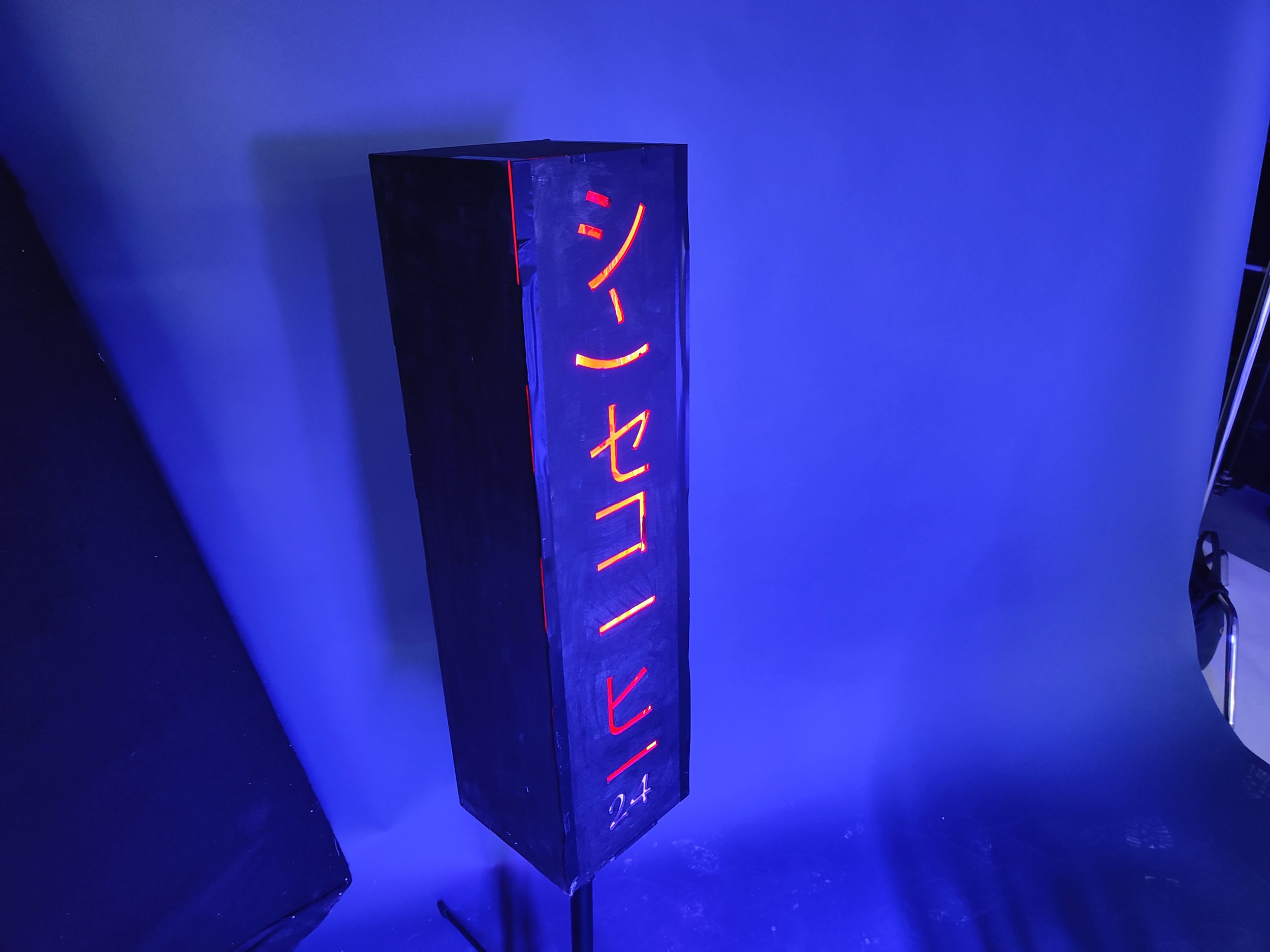
To create the lighting on the face I used a projector and designed several different company logos, on my computer


The logos had to be comparatively simple in design and also stand out. At the time I didn’t realise but using lighter colour backgrounds for the image didn’t work and would just light up the face in a horrible way. Hence changing the logo backgrounds to black.
The second thing I learnt was the projector had to be quite close to the subject due to light loss and this meant that the logos had to be shrunk down to a much smaller size (which my assistant, who was much more knowledgeable in photoshop was able to do).


The next thing to do was to add a main and possible back light to the shot. I decided to use one of the LED lights as the main light, coming in from the right. This would match in well with the lit up sign. Of course the compromise was shooting at a higher ISO but this would have to be done no matter what, due to the amount of light hitting the subject from the projector

One of the challenges was getting the background right, as I had decided to go quite wide with my lens, to give the subject (my assistant) a more distorted look., to help with the dystopian feel. The effect on this was my background wasn’t big enough and I had to bring in a covered poly-board to hide the studio.
one of the problems I encountered was the smoke just wasn’t thick enough, with very little defined smoke, so I could only shoot a couple of frames before the smoke would just become a blanket with little to no definition. Below you can see the unedited version of the photo.

With the final image, I decided that I would add more contrast, but this would have the side effect of darkening the image, and there would be a loss of detail in the blacks, which had been effected by the smoke anyway. This hurt the image in competition, as showing details in the blacks is considered important, but I felt the extra contrast would help the image. I also experimented with different framing, cropping the image to give it a more cinematic feel (the below image was the image I put into the BIPP nationals and is darker than the original edit, with some colour change).

Apart from the blue image, I also tried red, which again had its positives and negatives, but I feel the blue image is much stronger.

After finishing the first shot. I had the idea of creating a Jedi shot, as the smoke and blue reminded me of images from Star Wars

For me, this image doesn’t quite work as well as I would like. I like the lighting and use of shadow but I wasn’t happy with the post production, which didn’t quite work as I would have liked. I used one of the LED lights in camera to create the light sabre but I knew I would have to finish it off in post production and this didn’t quite work out as I would have liked. I also have to clear up a lot of the floor, which didn’t work as much as I would have liked. Overall an ok image but nothing special.

This for me is a very standard image, using the green light to help tell the story The makeup and use of green with smoke is designed to give the image a more evil feel but essentially this is just a simple Rembrandt lit shot with a couple of back lights. It could be argued that showing the back of the hands is a mistake but with the tatoos the hand placement felt right. The Ank on a chain again helps tell the story a little.

The final image from the shoot, was a very simple image. Lighting the subject from the front and back, and having two lights on the background, giving an even light. The reason I did this shot was I had no real images, where I just used the background as a colour and a background is often one of the most important elements when using colour, and I wanted to demonstrate this when putting in the image for this unit.
Of all the shoots, I did I feel that this was probably one of the most successful. I tried various things I had never done before and I felt that for the most part I was successful.